I am not a web designer. But since Makespace is currently neck-deep in clients, keeping all our designers ridiculously busy, I figured I would pitch in with a post about one of the guiding principles of good web design: simplicity.
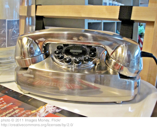
My family is house hunting right now. We recently discovered an old rotary dial phone in the basement during a showing. Since neither of us had seen one in years, we asked our seven year old if she knew how to make a call on it. She immediately showed us how to pick up the receiver and dial (with gestures! We didn't actually have our kid make a call on a stranger's home phone!) It's possible she knew how to do it from television or movies. I suspect it was mostly because a rotary phone has a wonderfully simple and accessible design.
Let's face it, if you put a person from a pre-industrial culture in front of a rotary dial phone, and told them it was a communication tool which required that they enter a numeric code, it probably wouldn't take them much trial and error to figure it out.
It's an elegantly simple design, focused around a single purpose.
Now imagine handing that same pre-industrial person an iPhone, the same instructions, and a phone number. Apple prides itself on simplicity of design, but how long do you think it would take them to figure out how to use it? It's possible he or she would give up in frustration before ever managing to make a call.
A basic rotary dial phone's simple design isn't a bug, it's a feature.
Like a phone, a business website design is primarily a communication tool. In this time in history, it's a vitally important communication tool for businesses who want to sell their products and services both locally and globally. Because we know how important it is, there is the temptation to load it down with as many features and as much content as possible.
However, it's important to consider the cost in clarity and user experience associated with loading down your website design, particularly the home page design, with too many options. You want to communicate the most important information. Your goal is to gently guide your web users towards actions that will convert them from a web visitor to a customer.
When you're reviewing design sketches and wireframes for the homepage of your new business website design, try to remember that while an iPhone is an impressive and fascinating piece of technology, a design that's more like a rotary dial phone--one that's elegantly simple and easy to navigate--will be more likely to make your real business phone ring with new customers.
Even if your real business phone actually is an iPhone.


